Homesure

Homesure is a large-scale consumer website that supports homeowners navigating complex decisions around home protection. I led a redesign focused on clarifying dense content, improving navigation, and reducing cognitive load, with the goal of making the experience feel more approachable and transparent for a broad and diverse audience.

Homesure is a large-scale consumer website that supports homeowners navigating complex decisions around home protection. I led a redesign focused on clarifying dense content, improving navigation, and reducing cognitive load, with the goal of making the experience feel more approachable and transparent for a broad and diverse audience.

My Role

My Role

UX/UI Designer, UX Researcher

UX/UI Designer, UX Researcher

Timeline

Timeline

December 2025

December 2025

Tools

Tools

Figma, FigJam, Jira

Figma, FigJam, Jira

Disclaimer: This project has been anonymized and redesigned to honor confidentiality and NDA requirements. All branding, naming, and visual/UI details shown here are conceptual and do not represent the original client.

Disclaimer: This project has been anonymized and redesigned to honor confidentiality and NDA requirements. All branding, naming, and visual/UI details shown here are conceptual and do not represent the original client.

Disclaimer: This project has been anonymized and redesigned to honor confidentiality and NDA requirements. All branding, naming, and visual/UI details shown here are conceptual and do not represent the original client.

Problem & Context

A nationwide home-services company partnered with our team to modernize and reorganize their customer-facing website. The platform supported several distinct user groups, but over time the experience had become difficult to navigate, visually inconsistent, and challenging for internal teams to maintain. Our goal was to reimagine the information architecture and redesign the interface so it felt more intuitive, modern, and supportive for a broad range of users

A nationwide home-services company partnered with our team to modernize and reorganize their customer-facing website. The platform supported several distinct user groups, but over time the experience had become difficult to navigate, visually inconsistent, and challenging for internal teams to maintain. Our goal was to reimagine the information architecture and redesign the interface so it felt more intuitive, modern, and supportive for a broad range of users

Discovery & Understanding

01

Understanding the Existing Experience

We began by developing a clear understanding of the current site experience through stakeholder interviews and a detailed UX audit. This helped surface where navigation, content hierarchy, and visual consistency were breaking down across the platform. Early on, it became clear that the experience had grown fragmented and no longer reflected how users naturally approached home protection decisions.

Defining a Clear Structural Foundation

With these insights, we rebuilt the site’s structure from the ground up. We created a revised sitemap, content maps, and low-fidelity wireframes to establish clearer hierarchy and more intuitive navigation. This foundational work aligned teams early and provided a shared blueprint that guided design decisions throughout the project.

03

Identifying Friction and Cognitive Load

As we evaluated key user flows and content patterns, we identified recurring sources of friction. Users struggled to locate critical information, scan dense pages, and understand what actions to take next. These issues slowed decision-making and created unnecessary cognitive load, particularly for users navigating high-stakes or time-sensitive scenarios.

02

Early Discovery in Practice

Discovery for Homesure was highly collaborative and cross-functional. Because the website touched many parts of the organization, we worked closely with stakeholders across product, marketing, and content to align on priorities and constraints early. Regular working sessions allowed us to review findings, pressure-test assumptions, and validate direction as insights emerged. This approach ensured that discovery outputs were not treated as static documentation, but as shared tools that informed decision-making in real time. By grounding the work in both user needs and organizational context, we were able to move into design with clarity, alignment, and momentum.

Design Strategy in Practice

Turning high-level strategy into practical, human-centered design decisions.

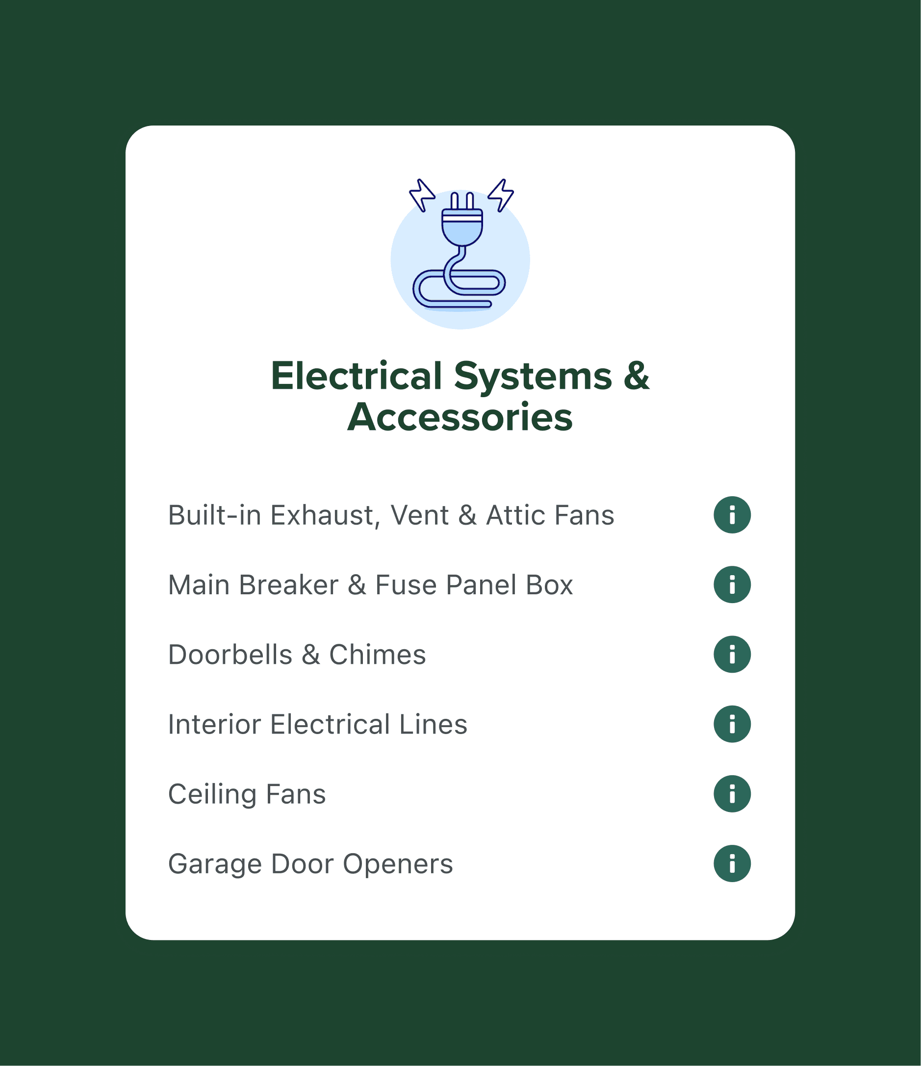
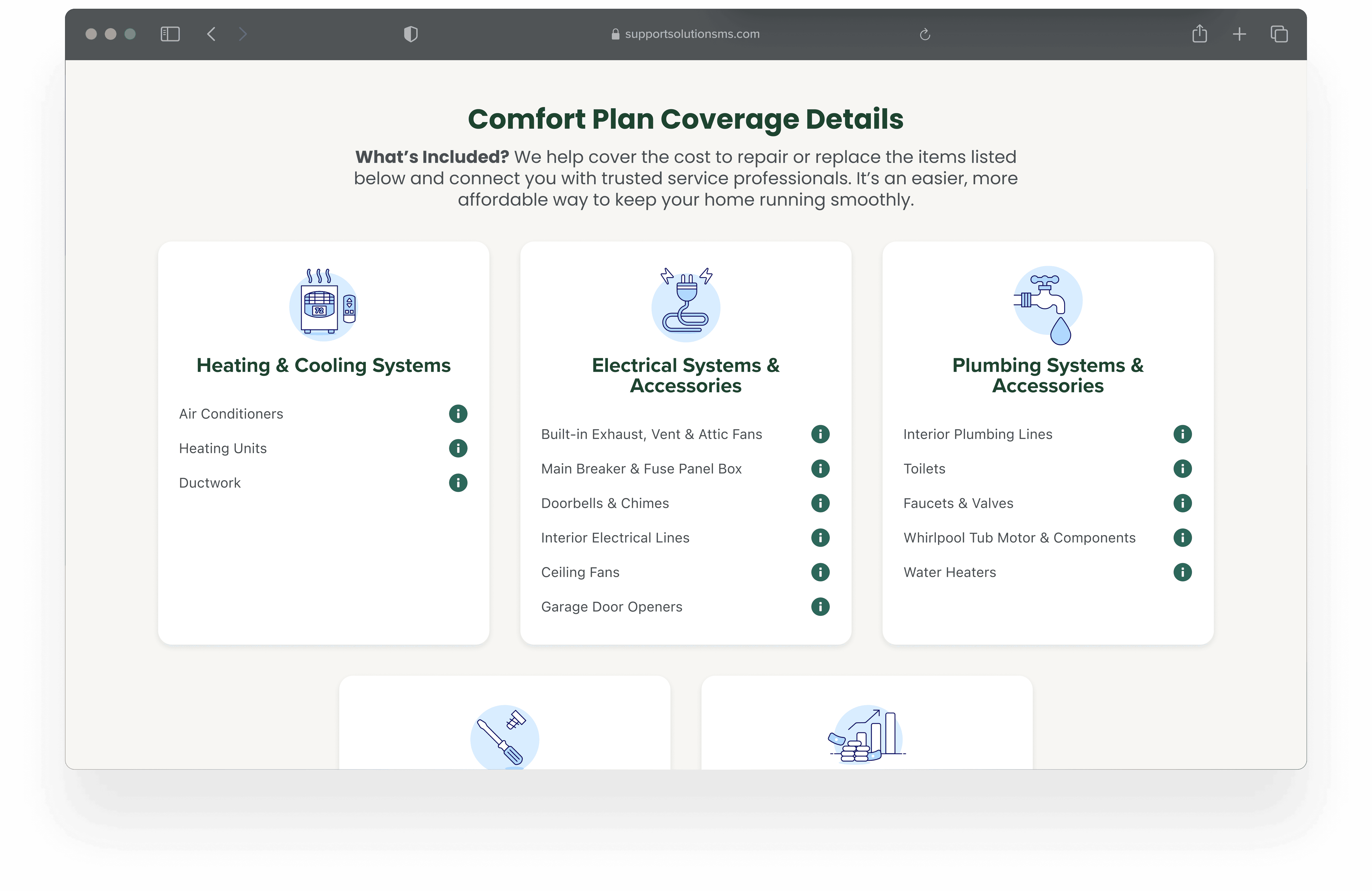
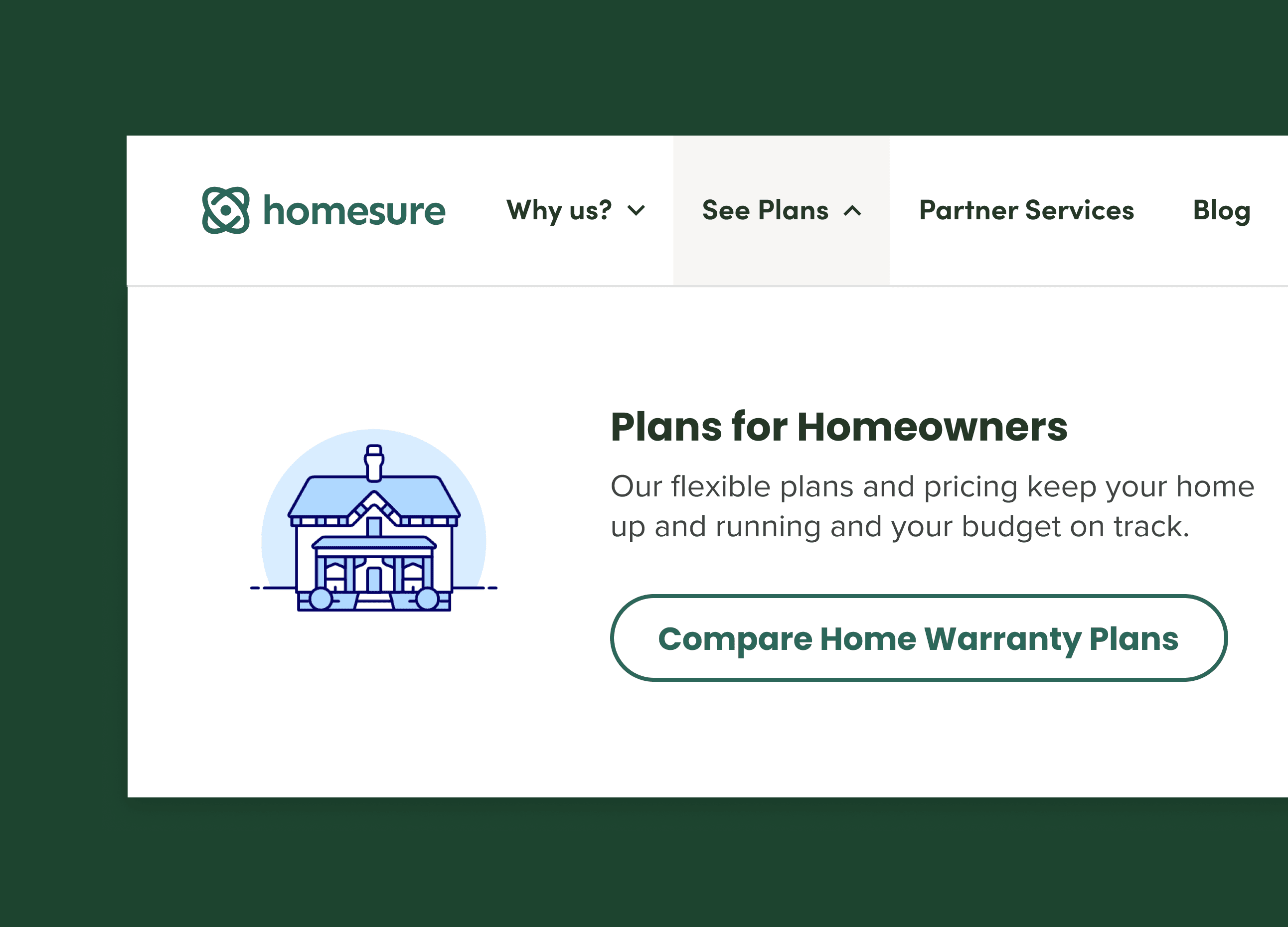
Only what’s needed, when it’s needed

Information and actions were revealed progressively to keep screens focused and prevent users from feeling overwhelmed by too many options at once.

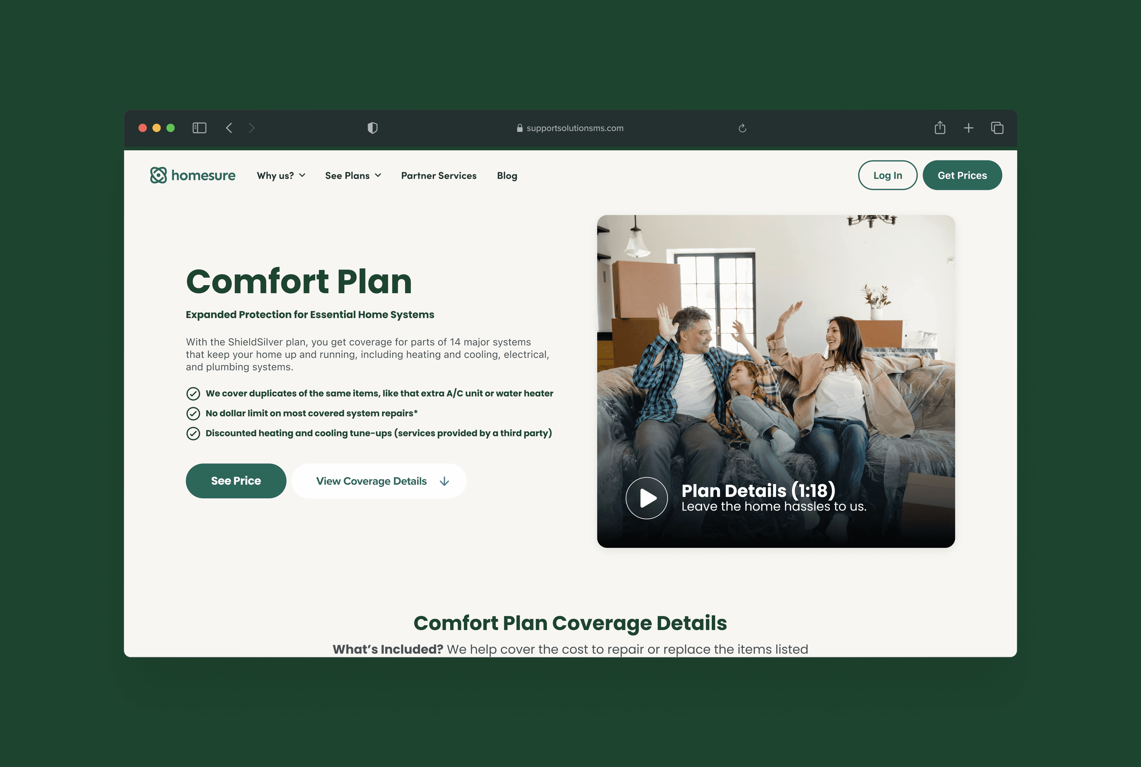
Structure before polish

We translated low-fidelity wireframes into high-fidelity designs only after the underlying structure felt sound, ensuring visual decisions reinforced clarity rather than masking complexity.

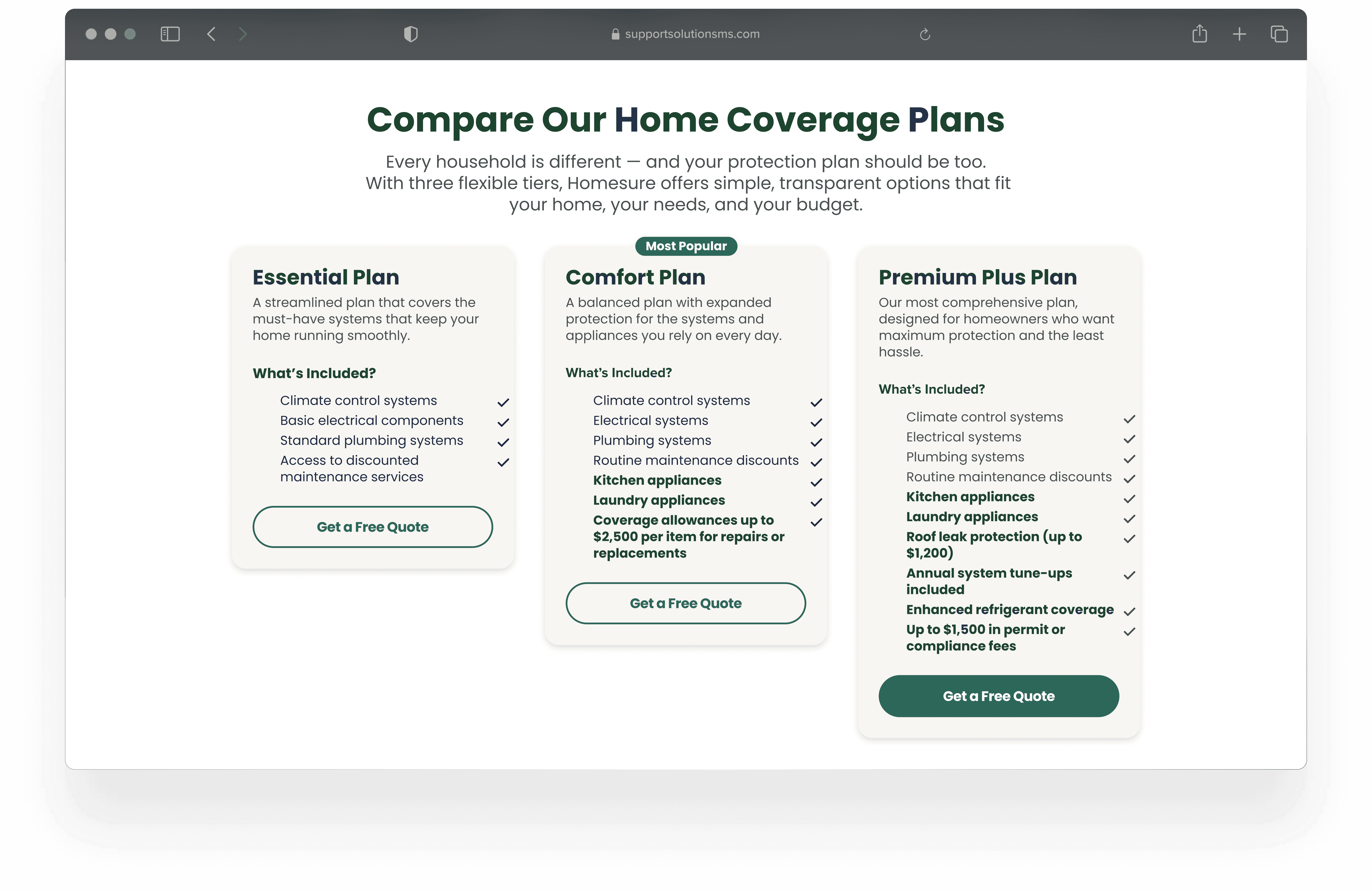
Navigation built around real tasks

Primary navigation and page hierarchy were refined through iteration and testing to better match how users naturally approach home protection decisions.

Designing with constant feedback

Regular stakeholder reviews helped us pressure-test assumptions, refine details, and ensure the design stayed aligned with both user needs and business goals.

Iteration as a quality control system

Key components like pricing presentation and content layouts went through multiple rounds of refinement, with user feedback serving as a steady validation loop throughout the process.

Design systems for scale and consistency

Given the size of the site, we prioritized a clean, organized design workflow in Figma to support consistency across pages and reduce friction during iteration.

From handoff to high-confidence launch

Design support continued through development, including documentation, QA, and adjustments to ensure the final build matched the intended experience down to the details.

Final Experience

The final experience delivers a clearer, more intuitive platform that supports users through complex home protection decisions with confidence. By prioritizing clarity, structure, and progressive disclosure, the redesigned site reduces cognitive load and makes it easier for users to find information, understand their options, and take action. The result is a modern, cohesive experience that balances business needs with user trust, creating a foundation that can scale and evolve over time.

The final experience delivers a clearer, more intuitive platform that supports users through complex home protection decisions with confidence. By prioritizing clarity, structure, and progressive disclosure, the redesigned site reduces cognitive load and makes it easier for users to find information, understand their options, and take action. The result is a modern, cohesive experience that balances business needs with user trust, creating a foundation that can scale and evolve over time.

Ashlee Mellencamp

©

2026

Based in Chicago, IL

Ashlee Mellencamp

©

2026

Based in Chicago, IL